For the past few months, the Marketing & Communication team at Old Skull Games has been working on the company rebranding. A brief explanation of all the changes made to this new branding can be found here!
Why rebrand the studio?
Our old branding was in place almost since the beginning of the company.
At the time, our strategic positioning was a bit broader. We weren’t a big team so a goofy logo that represented a small band of pirate buddies looked good on us.
We’ve grown a lot in the last few years, and our branding no longer reflected our values and ambition.
We swiftly went from a team of ten people to sixty; we moved into a new office in 2020, and the question of reworking our brand image became rapidly essential.
Now we wanted to show that we had become something big, a badass crew ready to defy all odds, and that old logo and its colors no longer represented our thirst to go even higher.
Very quickly it became obvious to us: we didn’t want to radically change our branding but to adapt our pirate DNA to a fresher, new universe more representative of our current state of mind and our vision for the future of our video games company.
How does the branding look now?
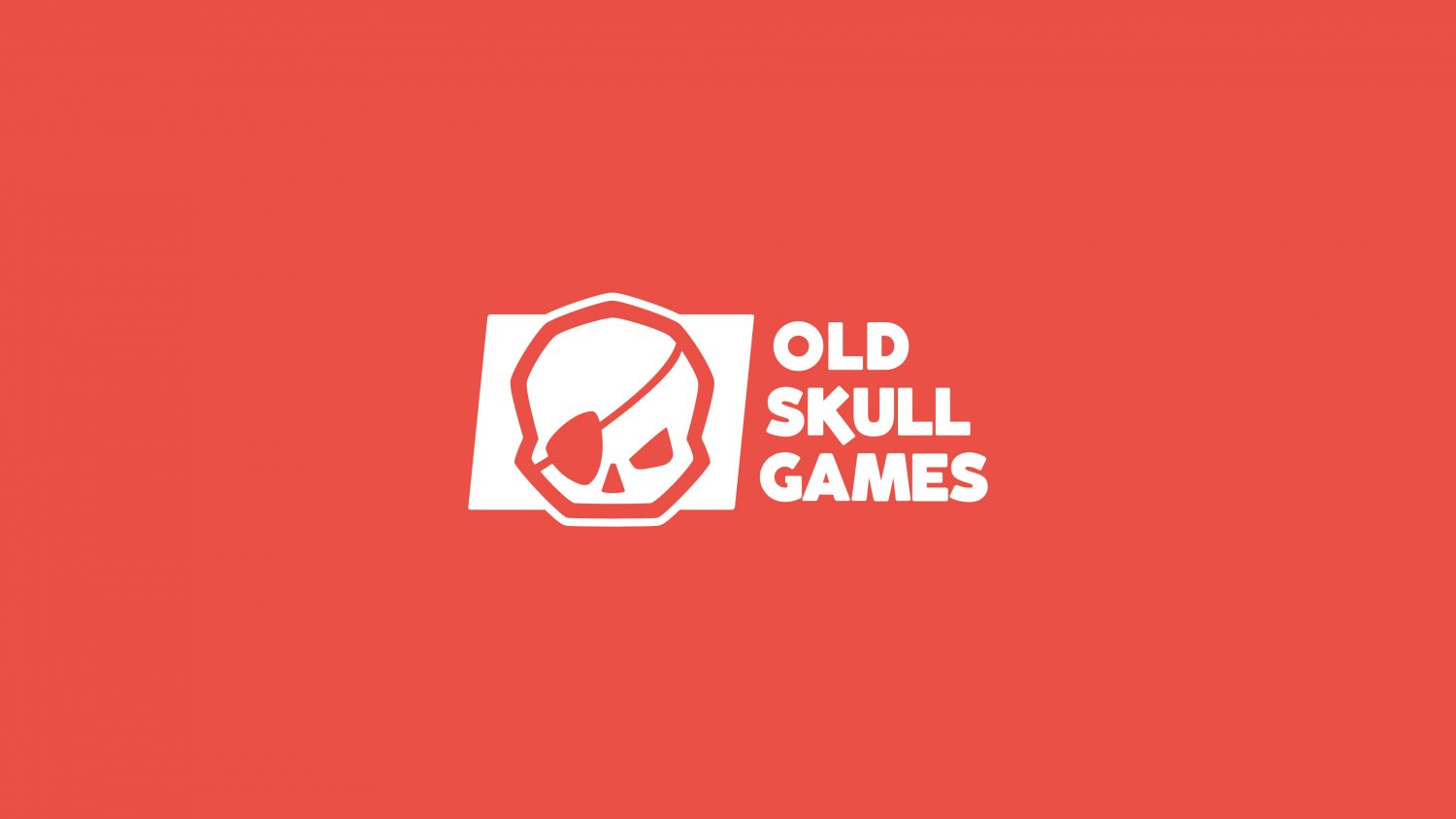
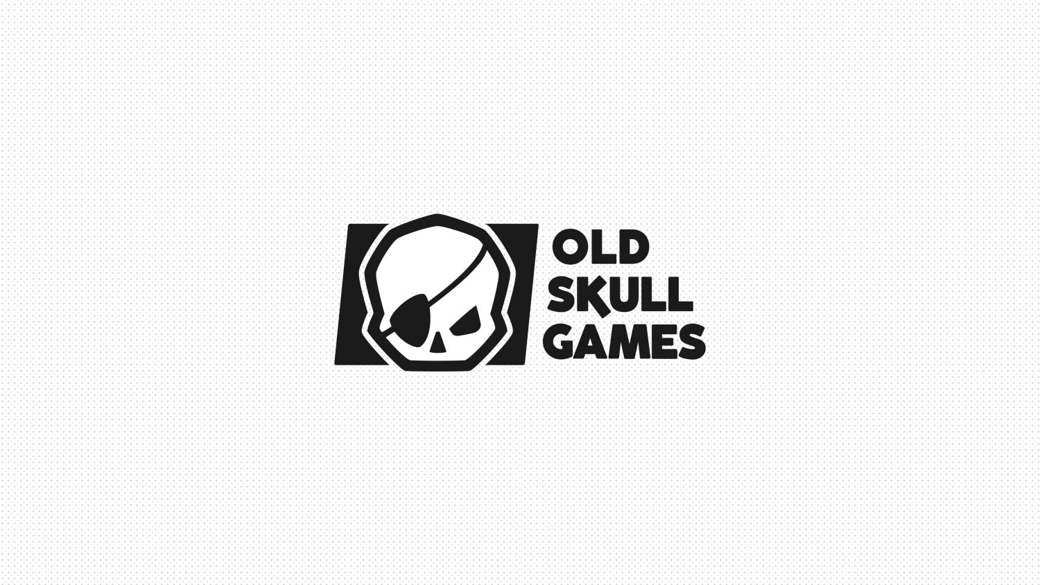
Let’s start with our new logo. Cleaner, more mature. It represents our thirst for adventure and our desire to win more and more new challenges. A bold and ultimately fearless skull!
We also tried in this branding not to forget the important values that constitute the studio, the main one being the benevolence between all of us.
To express this thirst for challenge and benevolence in the teams, we have preferred complementary colors that we believe bring these two worlds together perfectly.
So for the colors, take a clever touch of coral for extra vibrancy, dynamism and originality. Add to that a touch of turquoise blue when there is a need for a secondary softer and soothing color, and you have our new colors for this corporate branding!
In terms of graphic design, we opted for oblique lines, essential to illustrate Old Skull Games: always on the move and free from pre-established paths and straight lines.
Here we are, it’s a brand new image of Old Skull Games that you’re discovering as we communicate!